The art of Magic the Gathering
As much as Magic the Gathering is about the games, strategies, and chasing down the rare collectables, an indispensable part of Magic’s appeal has always been the the flavor and the stories weaved into the cards. Since the beginning, the artwork has been a crucial part of the game’s appeal and has inspired the imagination of several generations of players. Drawing from the imagery of fantasy literature, role playing games, and comic books, the cards are filled with illustrations of spellcasting wizards, heroes and monsters, angels, demons, dragons and undead, treasures and mythical locales.
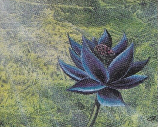
In the early days of the company, Wizards of the Coast was a small operation and struggled on limited resources. To acquire the artwork for the 295 cards comprising the first set, the company, with Jesper Myrfors as the art director, set out to hire a group of talented but unknown artists from the local arts college. During the first years, the artists were given a fair amount creative freedom, as evidenced by the variety of different art styles present in the early Magic sets. This freedom led to refreshing variation, with some of the most highly appreciated and iconic pieces of Magic art being created by this early group of artists. Similarly indisputable was the variation in the artists’ personal style, which makes the art in early sets both recognizable and memorable and, for many, the visual pinnacle of Magic: the Gathering. Indeed, the paintings of contemporary cards are often sold for thousands of dollars, while the original works from the early years easily command tenfold prices, and more. Earlier this year, the original art for the Black Lotus by the late Christopher Rush showed up for sale on a Facebook group, with a price tag of 6.5 million dollars!
The appreciation of the Magic art is shared by many of the Old School players, something I can definitely relate to. While I have never had the opportunity to possess any of the original Magic artwork, I do enjoy the look and feel of the old cards. Apart from the cards themselves, a relatively inexpensive way to appreciate the art and give something back to the artists are artist proofs, in particular when customized by the artists themselves. For me, this is a relatively new venture, but one that seems to approach collecting from a completely different perspective. Rather than chasing down the increasingly rare cards from 1993 - which at times seems almost vulgar due to the price volatility and the click-and-buy mentality of modern online marketplaces - the artist proofs and alters allow one to appreciate new facets of the art in a seeming tranquility, much like a fine culinary experience. An yet, it is still all rooted on a familiar grounds of the original art of Magic.
Geeking it out
Of course, this wouldn’t be a post on Quantitatively Old School, if I merely discussed my admiration of the Magic the Gathering art. So let’s get a little bit technical, and turn the geekiness knobs up to eleven.
Perhaps you have noticed the small logo that appears on the page banner. I am talking about this one:
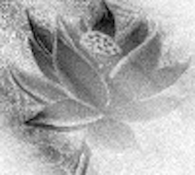
That is of course the Black Lotus, the card that so far has dominated the posts on this blog. The more recognizable form of the picture is (obviously!) the one painted by the great Christopher Rush:
When I was working on creating the blog at the end of last summer, I wanted to craft a logo that was recognizable for an MTG enthusiast that at the same time would also somehow capture the techy spirit of the blog. Quickly I settled on using some form of the Black Lotus as the logo. I considered running it through some image processing filters but the whole idea seemed kind of bland. Then I thought of something a bit different.
For many years, I have been working on computer simulations in various fields of physics. One of the areas has been Monte Carlo simulations and their application to radiation transport physics. This is something that is done, for example, as part of treating cancer with radiation therapy, for radiation detector modeling in high energy physics, and in radiation shielding calculations. So, I thought, why not re-interpret the Black Lotus art through an energy-deposition map, calculated by a simplified radiation transport Monte Carlo simulation. Indeed, why not.
So, in short, I quickly wrote a Monte Carlo code that does radiation transport in two dimensions with completely bogus physics1 and quite an inefficient computational speed. But it did what I needed it to do. I took a grey-scale version of the Black Lotus art and interpreted the pixel value as a material density. Then I directed a couple of particle beams at the underlying image, scoring the deposited energy for each pixel. Then I re-constructed the image based on the deposited energy. It was nice in the way that fiddling around with the “physics” parameters allowed me to adjust the blurring, graininess, and grey-scale gradients in the final image. All of this could have been done more easily with Python’s image manipulation libraries, but that wasn’t really the point.
So that’s how the blog logo came to be.
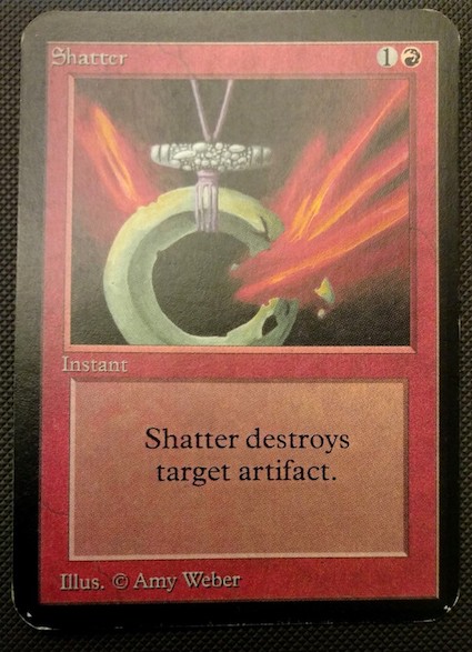
One of my personal favorite pieces of Magic artwork is the Shatter, by Amy Weber. In general I really like her artwork and style (as you may have guessed), but Shatter in particular is such a classic card.
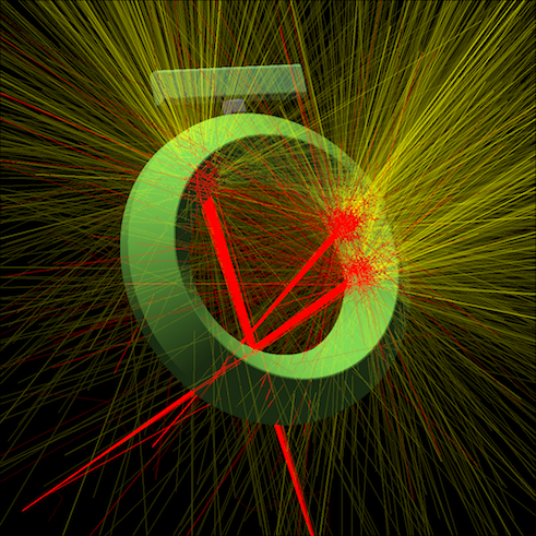
Some months ago I got the idea to re-imagine that piece of art by physics simulations. There’s a really nice and easy-to-use simulation code, the EGSnrc, that was perfect for the task. To be fair, I should mention that EGS is actually serious simulation package that is used professionally, for example, in radiation detector design and medical radiotherapy, and is considered by many as the gold-standard in that field. It calculates the transport of highly energetic photons, electrons and positrons in various materials, taking into account the physical interactions with very high accuracy. Although I am just using EGS here as a glorified ray-tracer to play around with and produce some images, it is actually a lot more than that.
With EGS, I tried to emulate the general shape of the artifact being shattered, without going into too many details in the ornaments. Keeping it simple, I still wanted to do something special, so I made the ring out of gold (that’s the material you need to specify in the simulation), and the mid-piece out of lead. Then I constructed three electron beams, 20 megaelecton-volts (MeV) in energy, aimed at various positions on the object. Then I let EGS do its magic, and this is what came out - an ancient artifact bombarded by electron beams, glowing in rays of golden light:2
Conclusions
Not much to conclude, except that I hope you enjoyed reading this somewhat silly and different kind of blog post. If not, rest assured that there will be more quantitativeness in the upcoming entries.
Footnotes
-
Isotropic scattering in 2D with only a single energy group, and absorption with zero secondary particles. Bogus, because I’m not aware of any real particles that would actually behave like this. Perhaps there is an analogue in solid state physics, seismology, or in some other field that I’m completely ignorant of. ↩
-
Yes, the colors are for visualization purposes. Everybody with more than a few skill points invested in Googling can find out that electrons are colourless, not red. Also the photons produced at those energies would be invisible to the human eye. ↩
Leave a comment